Postal StoreA new home for shopping
The perfect StoreA redesigned homepage, plus updated core navigation elements and branding
A new StoreSame voice, new look
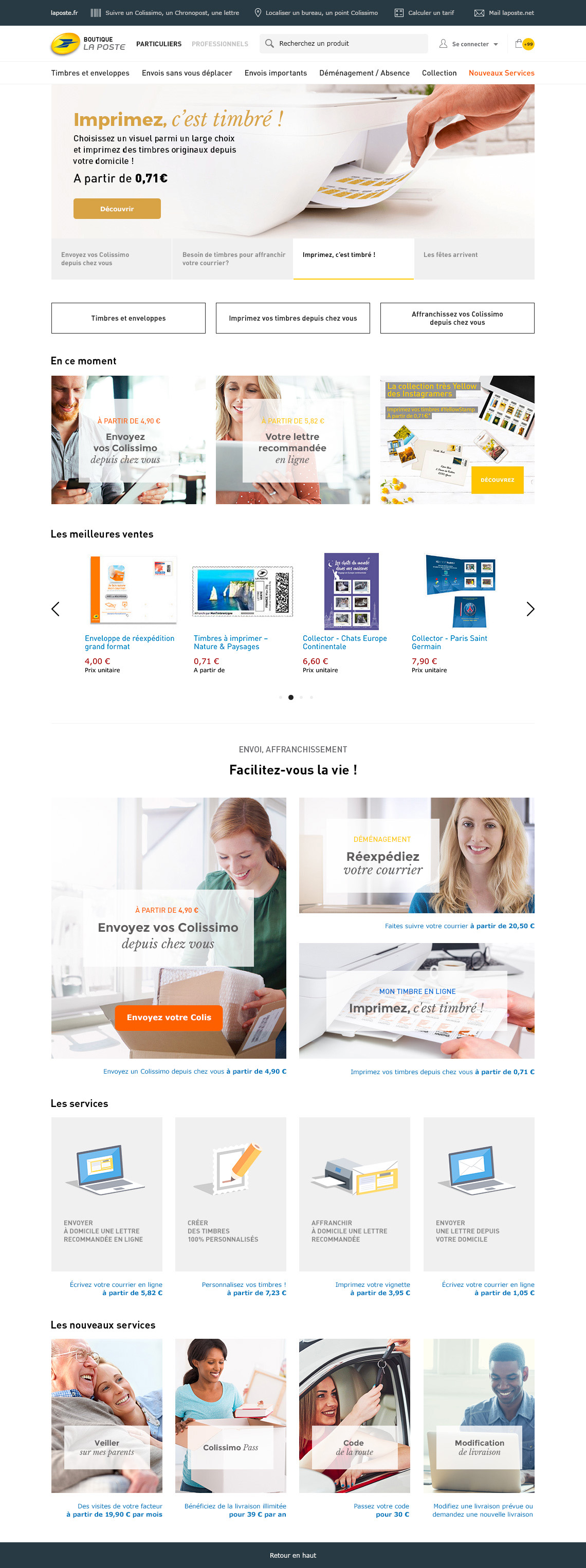
La Poste promises its customers an unrivaled experience. Using low and high fidelity wireframing, I organised the elements of navigation with minimal interactions in mind. Clear call to actions were introduced, but to let the content speak for itself and lead the user experience. My vision was to develop a product which enables easy access to information, allows rich media content to stand out, and makes checkout processes efficient.
This time it’s personalRemaking the homepage
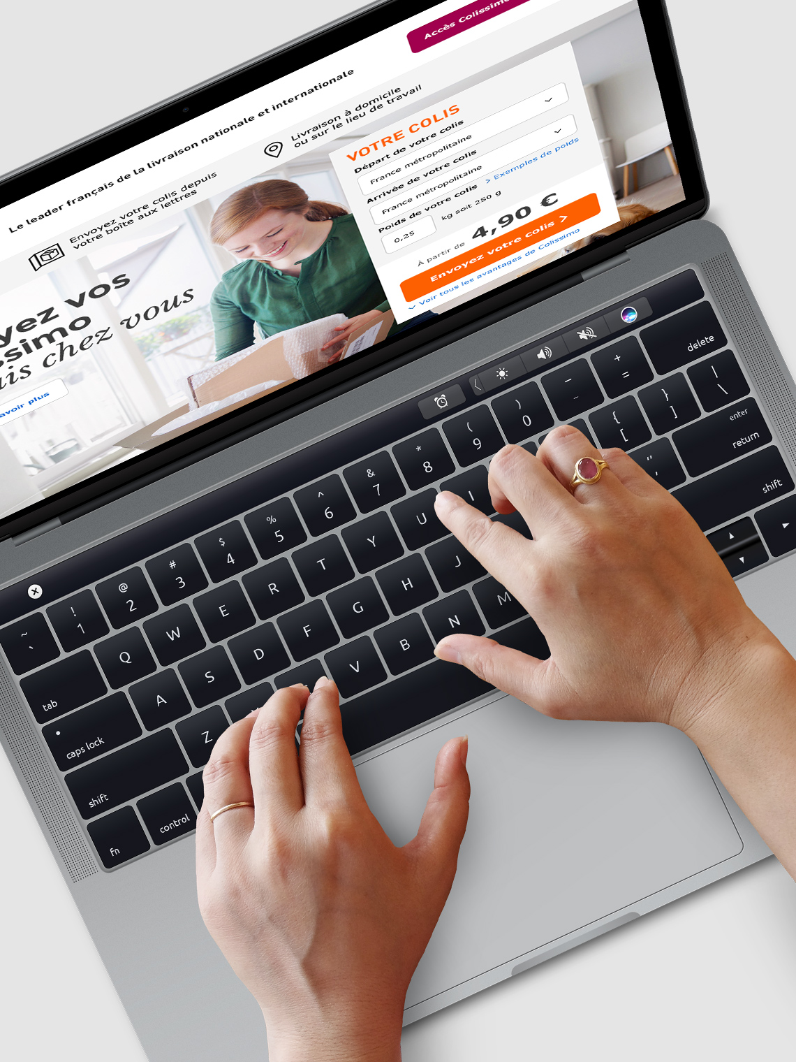
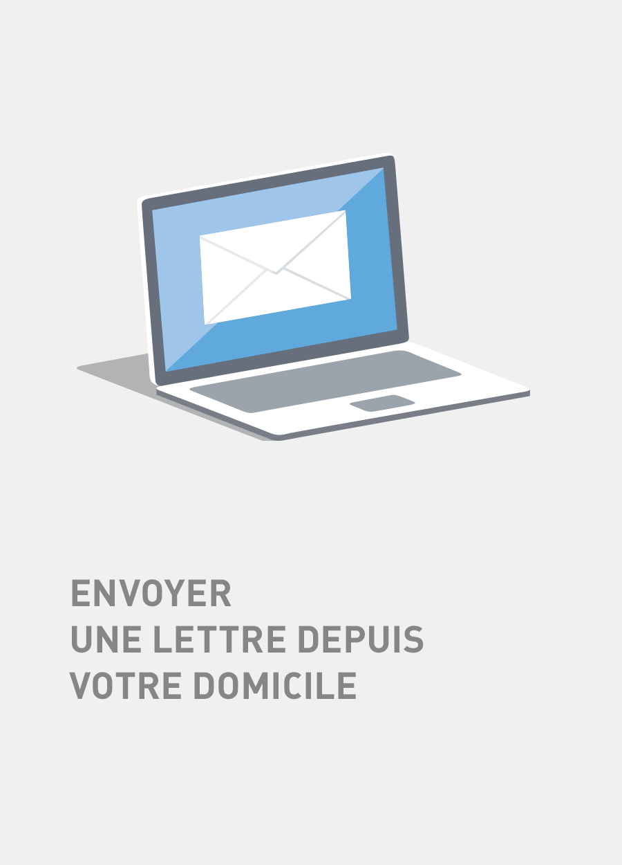
La Poste Boutique is the french postal store for mailing, shopping and shipping. It’s also for tracking shipments, discovering services, buying supplies and managing orders. Mix it all together and you’ve got the new Postal Store homepage.
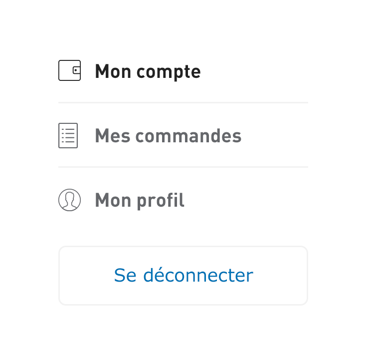
Find yourselfBetter navigation
La Poste wanted to revamp some of their core navigation elements, for example to make it easier for users to access their items and services. So that’s what I did.

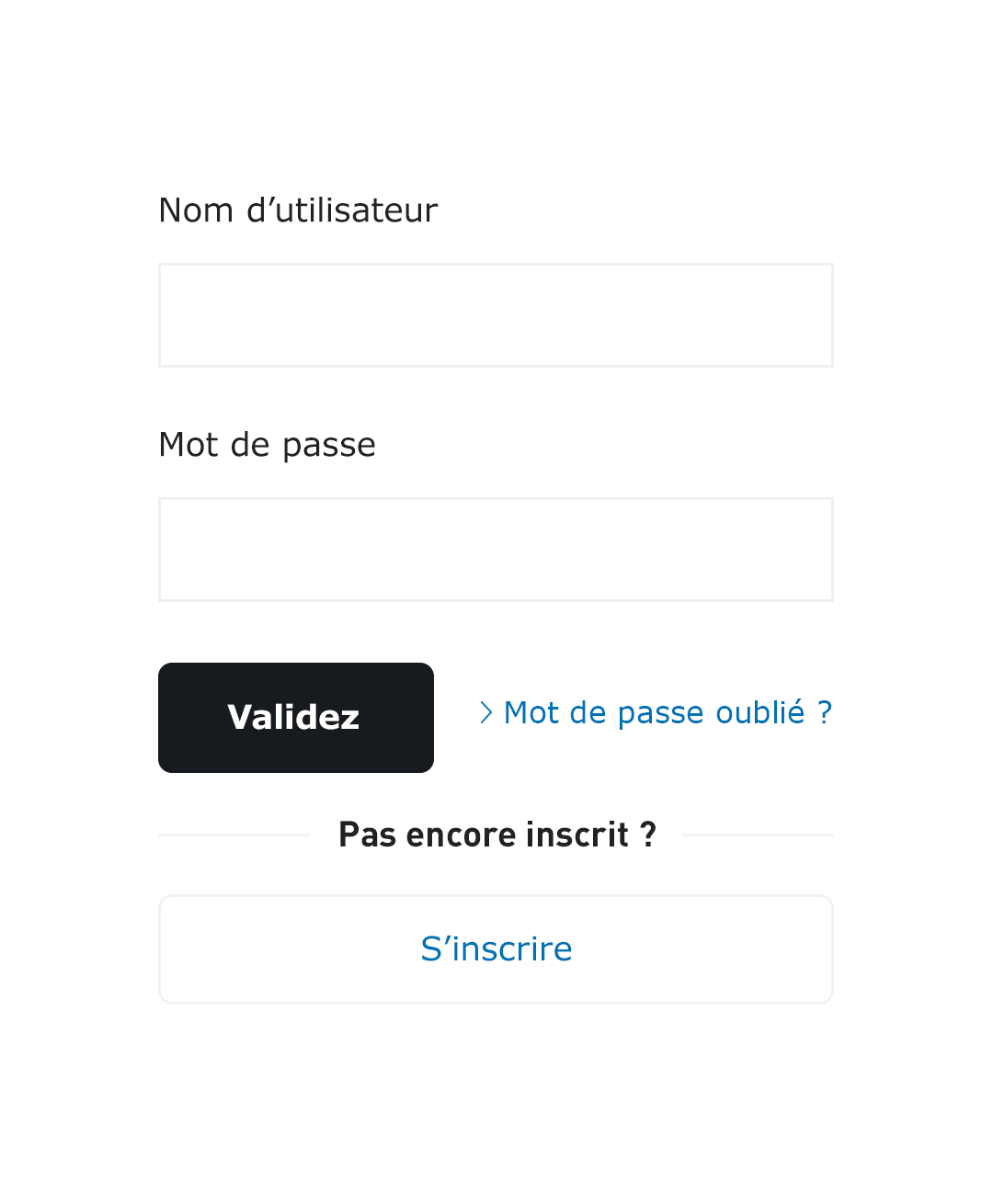
U and I foreverBringing the user interface to life
Even for a website as friendly and colorful as La Poste, navigating the user interface can be pretty dull. I developed small popups as well as clickable flyouts to help bring some well deserved life to them.
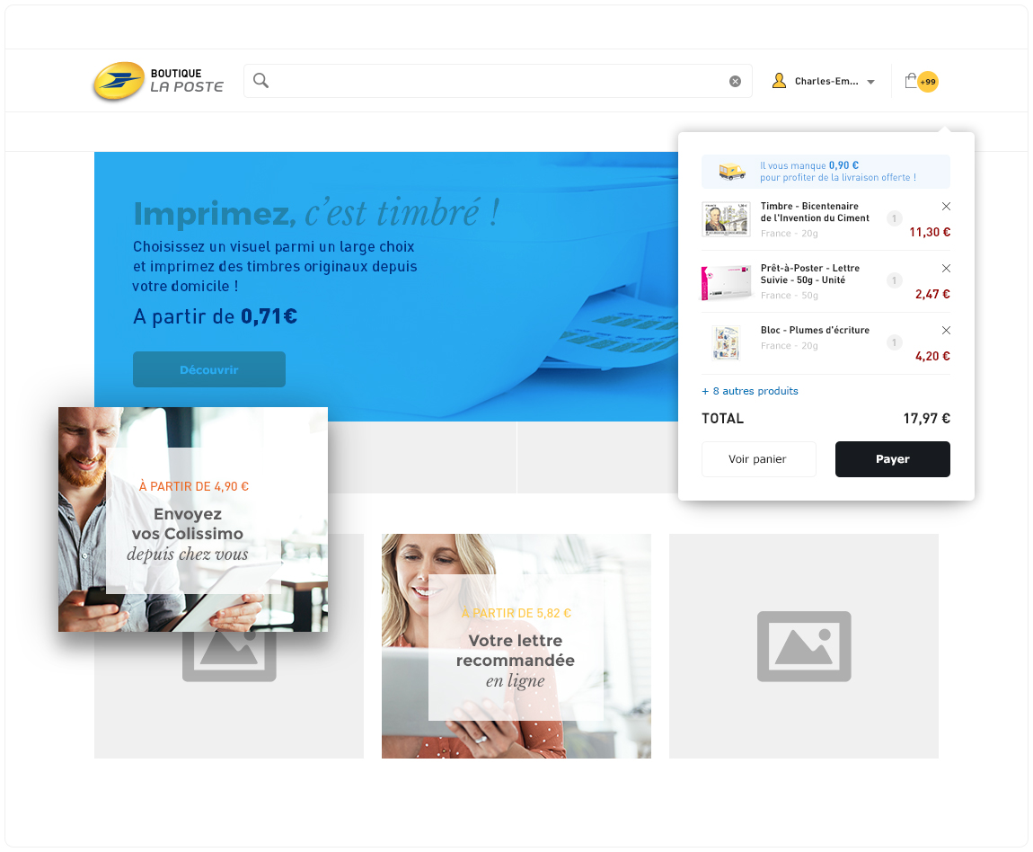
Out of sight, on your mindBuilding a better shopping cart
For a successful ecommerce site, the shopping cart is an essential piece of the puzzle. I designed a “shopping net” that doesn’t get in your way while you’re shopping, but pops out from the top when you need it.

Less lost, more foundRedesigning search
Searching for a product on La Poste is a relatively complicated business. My aim was to make the redesigned searchbar easy to find and use, but subtle enough to let the writing stand out.

Think inside the boxVarious UI elements
There’s more to an online shop than words and pictures. Sometimes you need things like sliders, overlays and service boxes.
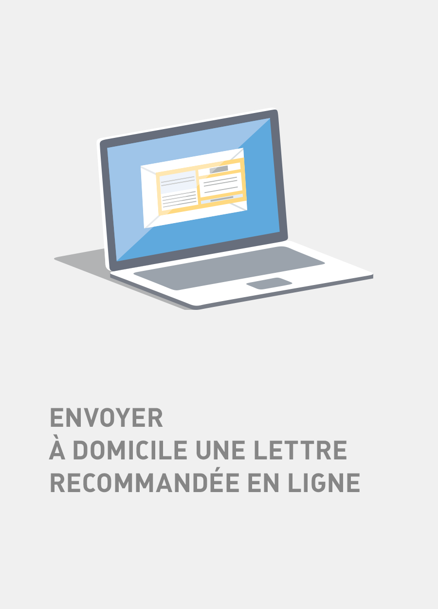
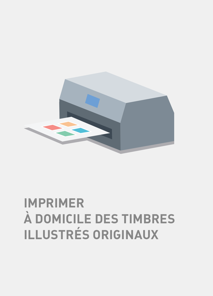

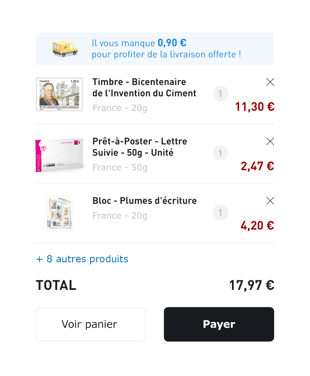
New servicesCustom pictures
I selected great images for new postal services, making the site look maximum good.


"It was important to really nail the homepage, because it needed to represent all different kinds of services that get done at La Poste. I executed on several iterations to make sure I really had something good."

Alexandre Moreau
Featured projects
I partnered with early-stage startups and large corporations through the years. Take a look at some of my selected case studies.