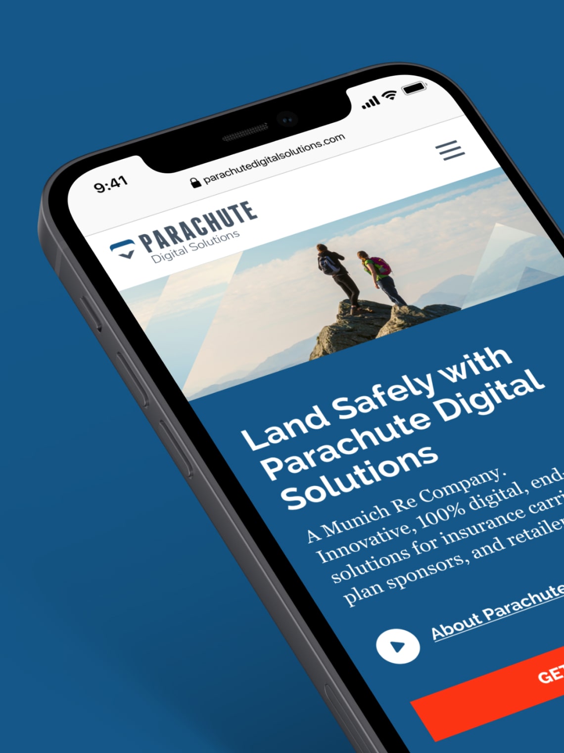
Parachute WebsiteLanding safely
A website with a messageParachute Digital Solutions wanted a new site to tell their unique and unfolding story to very segmented audiences in a huge market in the US and Canada.
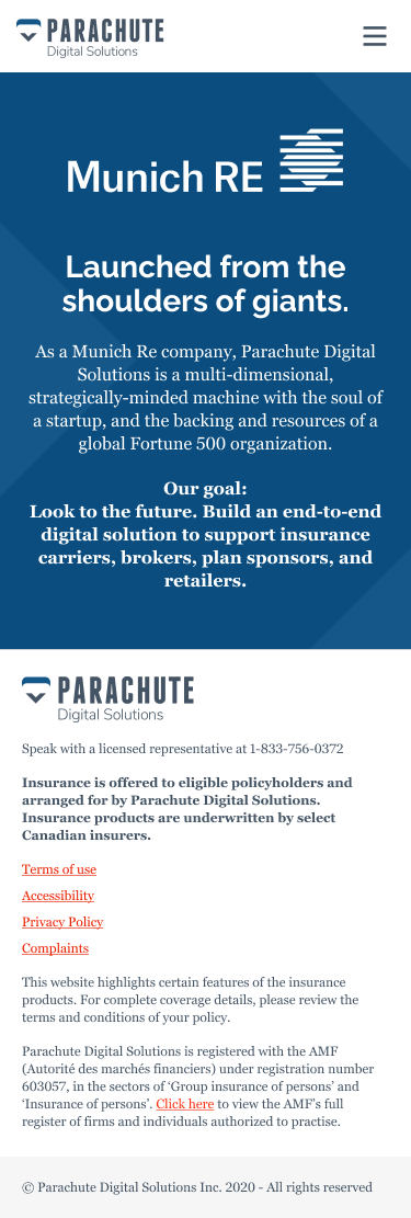
Parachute Digital Solutions Inc., a Munich Re company, is an insurance agency that offers a fully digital, end-to-end platform, hosting an array of insurance and protection solutions with their partners.
The company’s platform, Parachute, provides carriers, brokers, employers, and retailers with all the tools and tactics they need to future-proof their insurance business and offerings.
In 2017, Parachute ushered in the era of the easy-to-use, secure, and intelligent insurance partners platforms.
Four years later the innovative product had outgrown the brand. To better position itself as a leader in a rapidly changing market, the company came to me for a complete UX rethink, including a new website.
Enter Parachute.
What I did:
User research, data analysis, personas, user flows, information architecture, usability testing, clickable prototypes, responsive layouts, branding, design system, UI elements.
The new faces of insurance
A key component of my work for Parachute Digital Solutions was applying my thorough UX audit and research process. While a part of its new site is geared towards insurers, Parachute Digital Solutions is actually a B2B company servicing insurance professionals like carriers, brokers, employers, retailers. To reach out to potential new clients I reviewed analytical data and defined user personas, addressing their concerns.
Priorities from high to low
Along with data-driven personas, priority guides helped me determine user goals level from high to low, avoid the pitfalls of wireframes, and measure success even before I run early prototypes. It not only keeps the process user-centered and creates more valuable designs for users (whether used alongside wireframes or as a direct replacement), it’s also improved team engagement, collaboration, and design workflows.
A priority guide contains content and elements for any screen, sorted by hierarchy from top to bottom and without layout specifications. The hierarchy is based on relevance to users, with the content most critical to satisfying user needs and supporting user and company goals higher up.
Prototyping
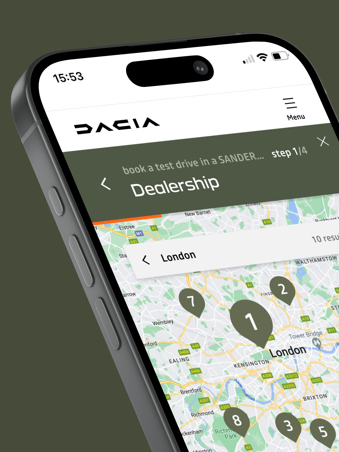
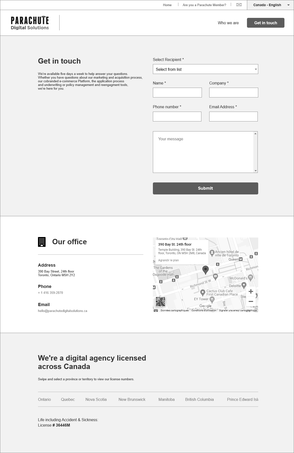
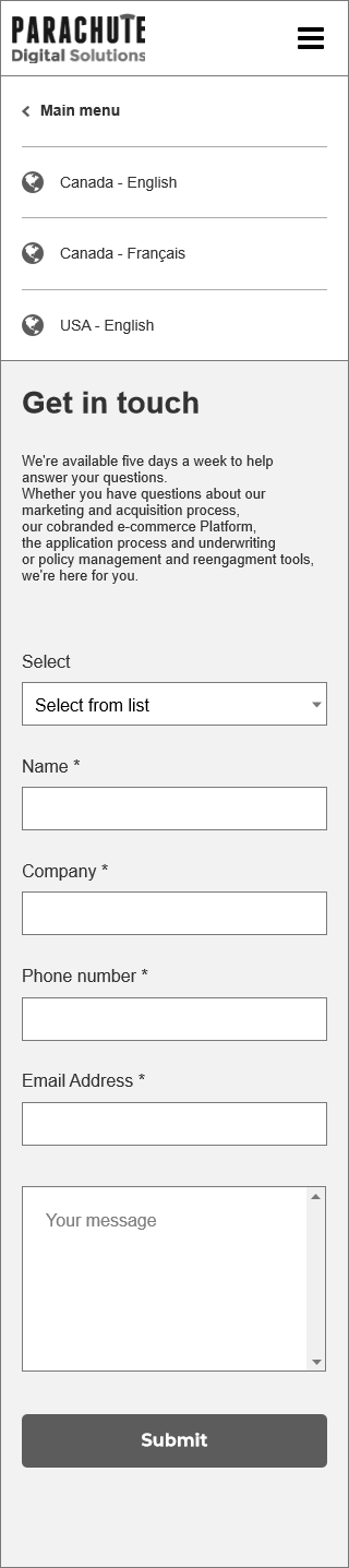
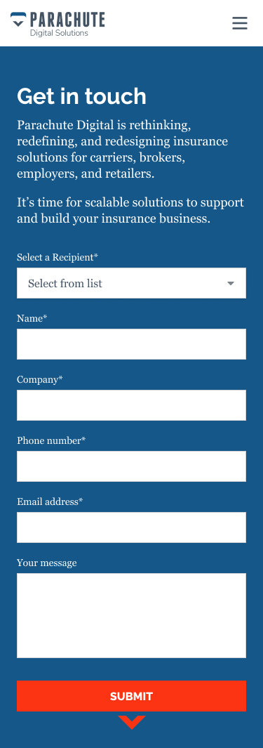
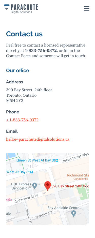
Parachute Digital Solutions works with thousands of independent local insurance professionals all over Canada and the US. The new site promotes end-to-end insurance solutions for carriers, brokers, employers, and retailers. The Parachute site also focuses on helping users find support informations like a contact form, a google map and a list of licensed agencies.

Adapting to mobile
The Parachute Digital Solutions site should look good and work well on all your mobile devices.

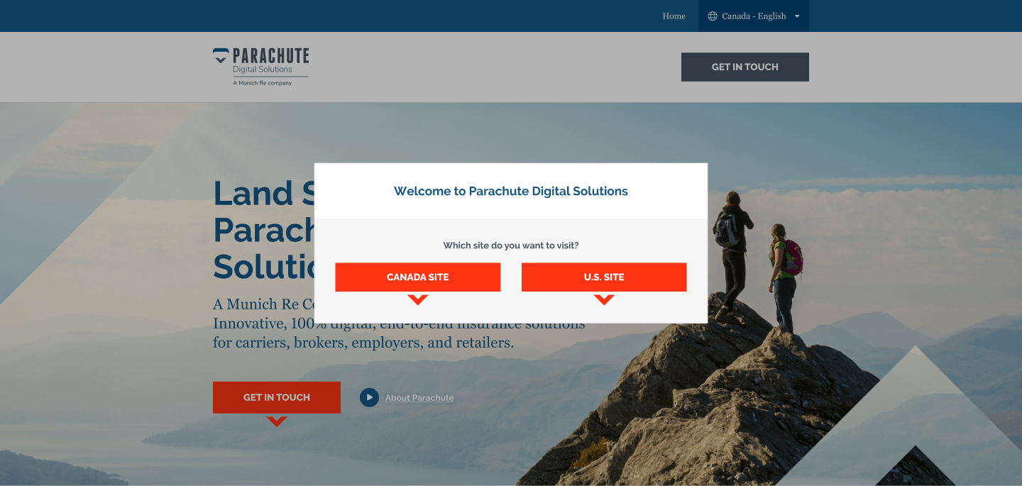
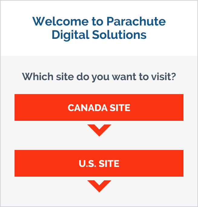
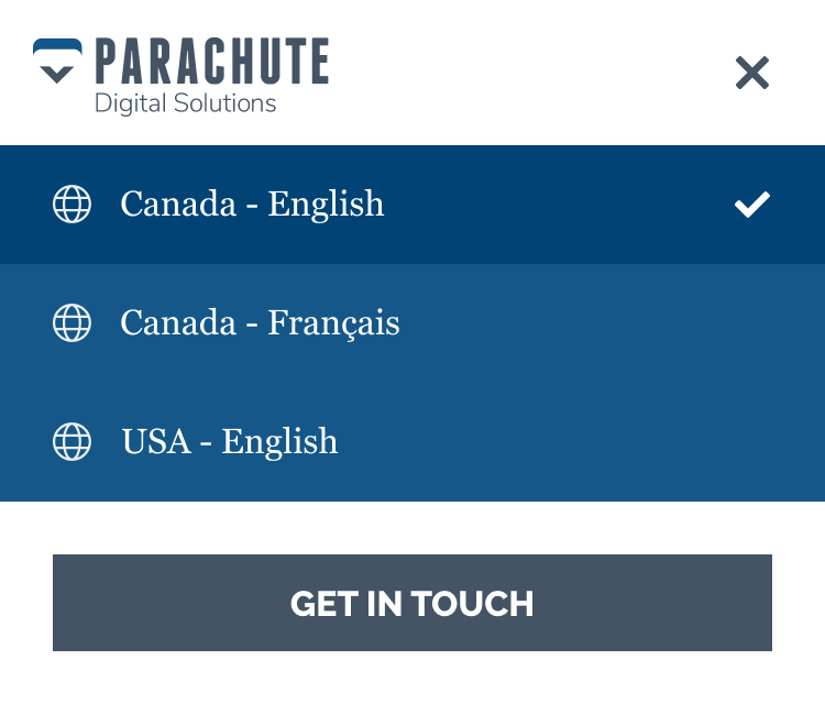
Canada or USA?A Parachute for everyone
Parachute’s website is designed to do the very practical job of guiding users to set their country/language of preference. Users are automatically redirected to the right site/country based on IP address. If not, this redirect message is displayed as an overlay.
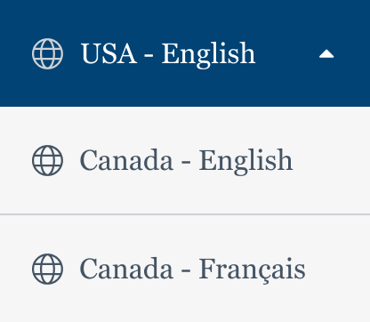
Finding your way
Big screen or small, there's always a country/language selector at the top for the user to toggle.


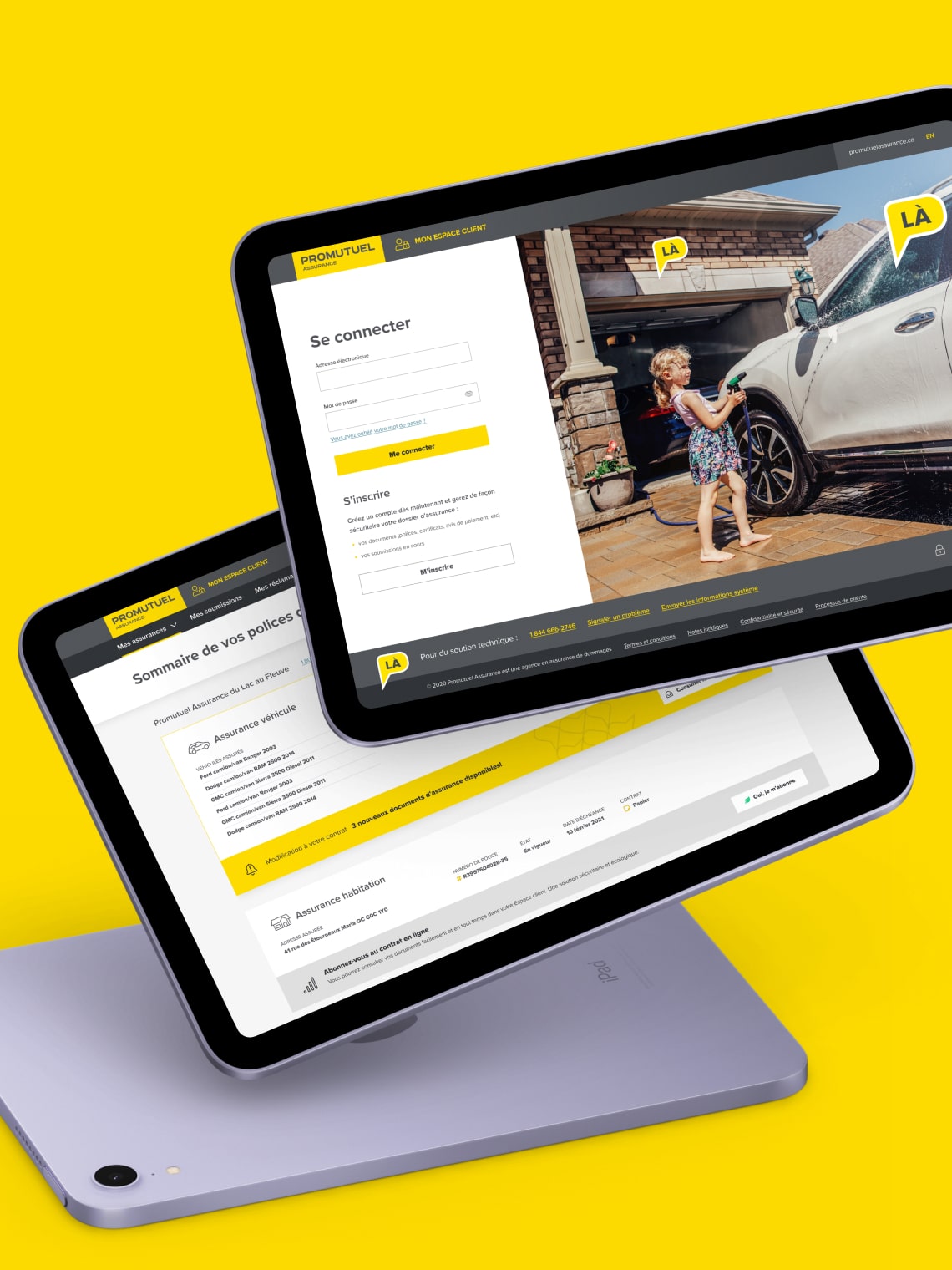
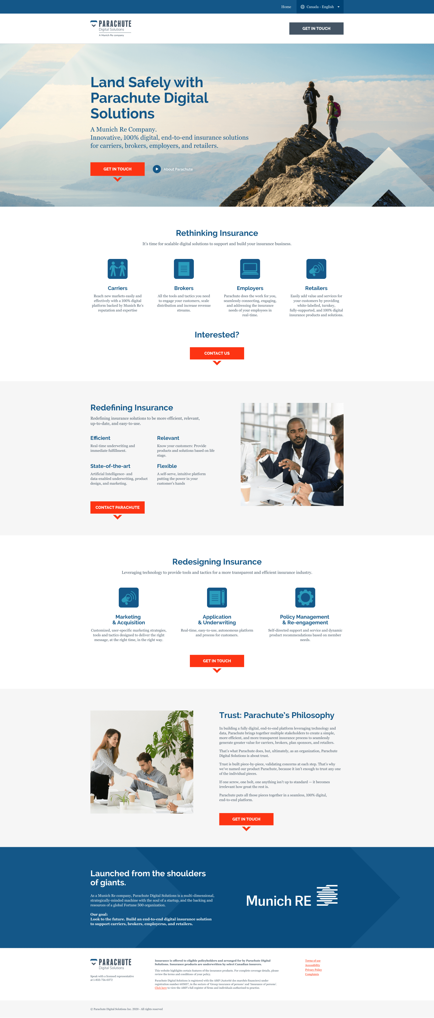
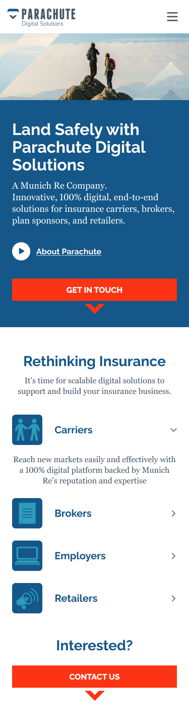
A home for ParachuteThe new website
Creating a B2B homepage poses quite the challenge. It’s key in giving that great first impression of your company and its identity as well as in providing all sorts of helpful information organized just so as to fulfill clients expectations.
Unique contact page
For every one of Parachute’s digital solutions for insurers, I created a custom page with all the contact informations.
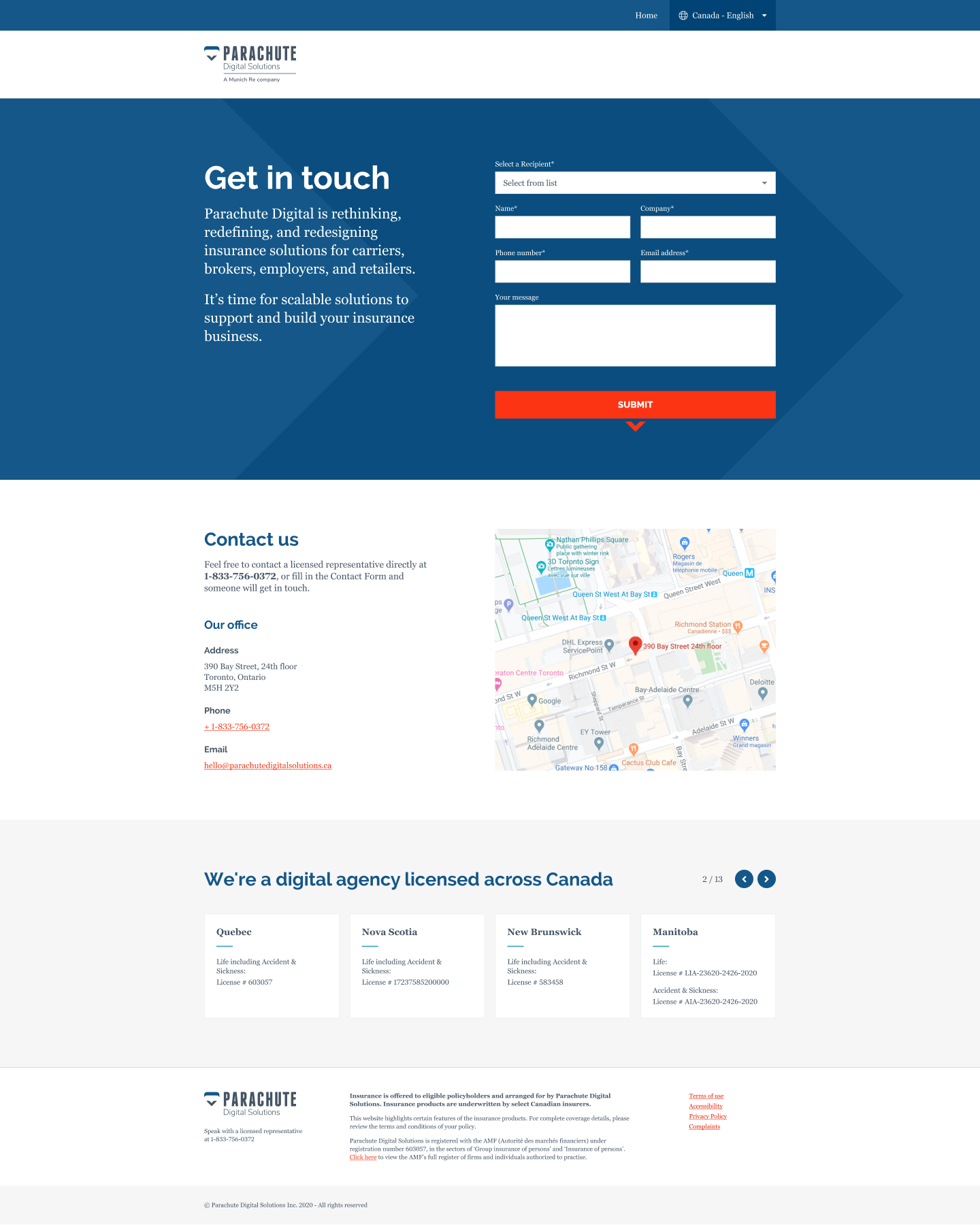
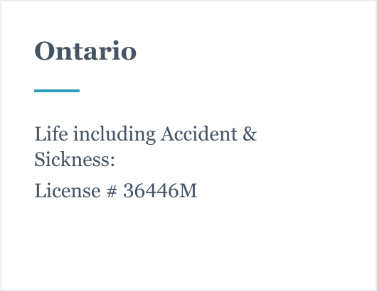
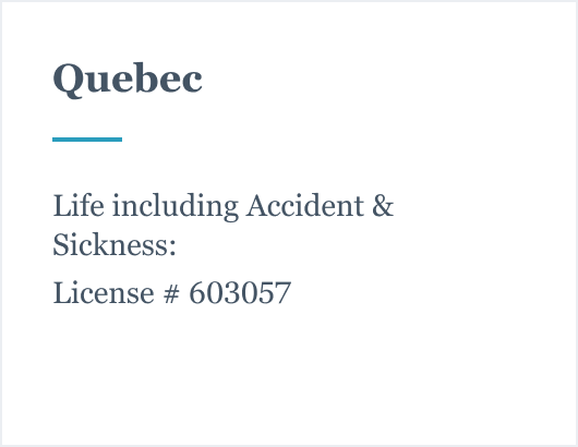
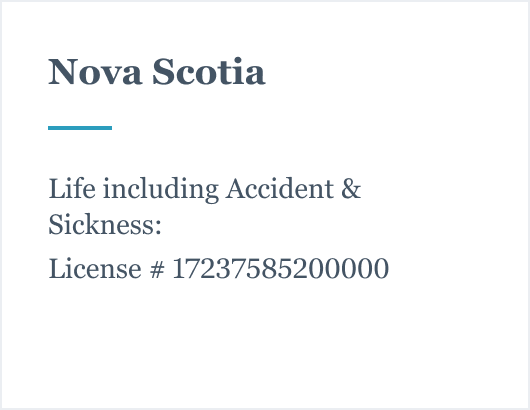
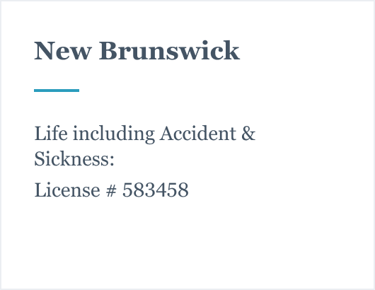
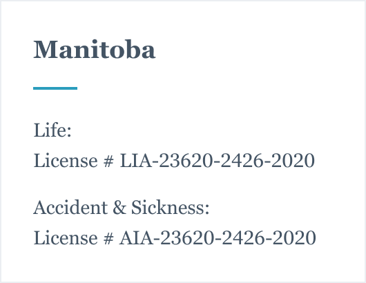
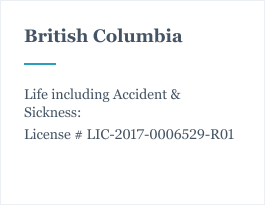
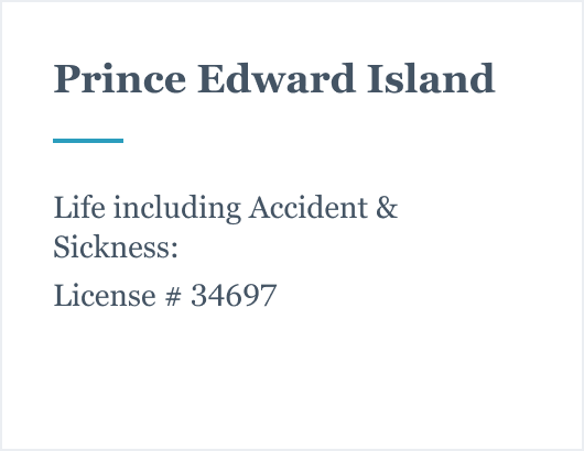
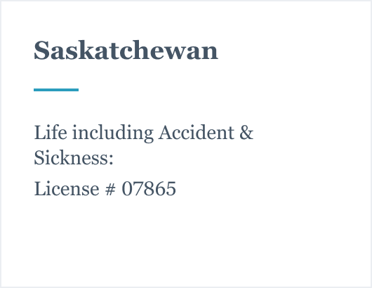
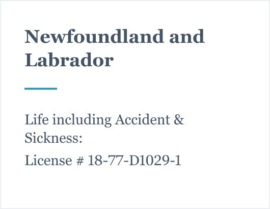
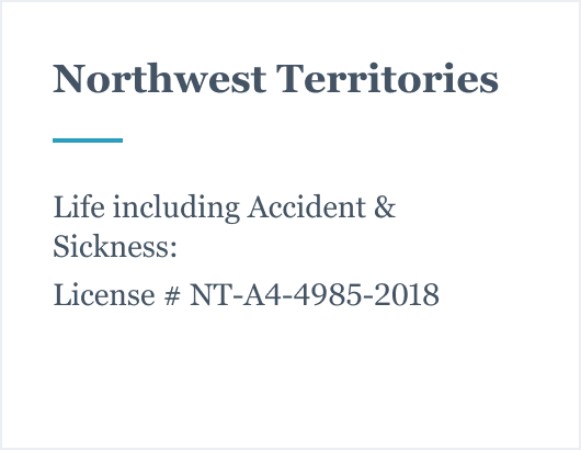
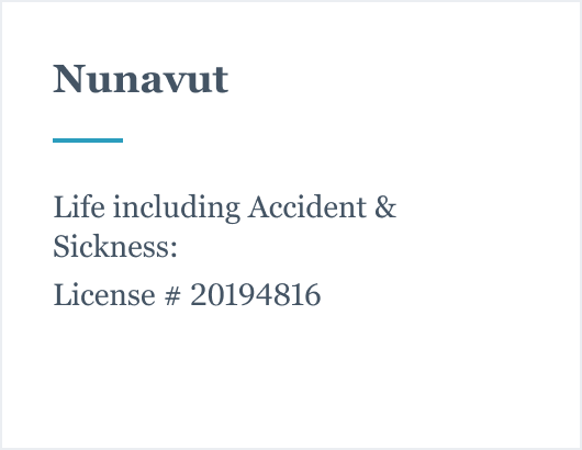
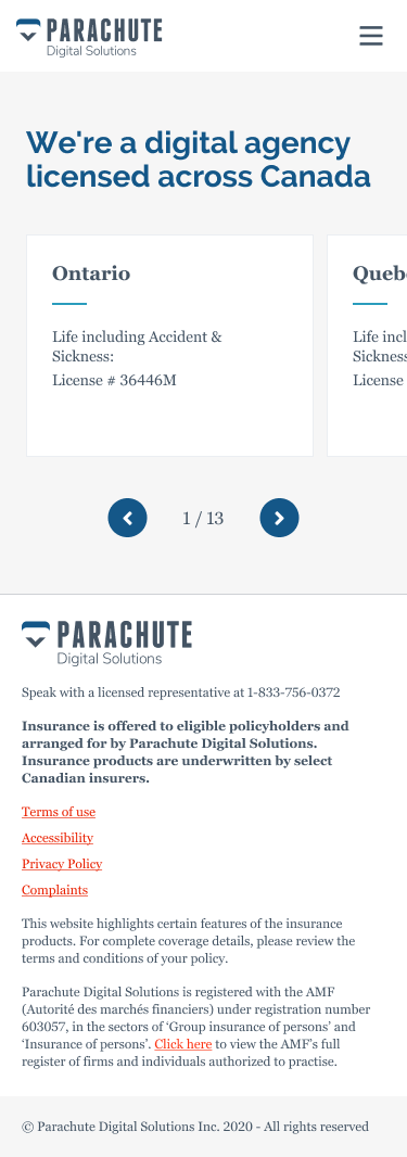
All over Canada
The canadian contact page features a swiper with a list of provinces and territories license numbers.


You’ve got mailAll about Parachute
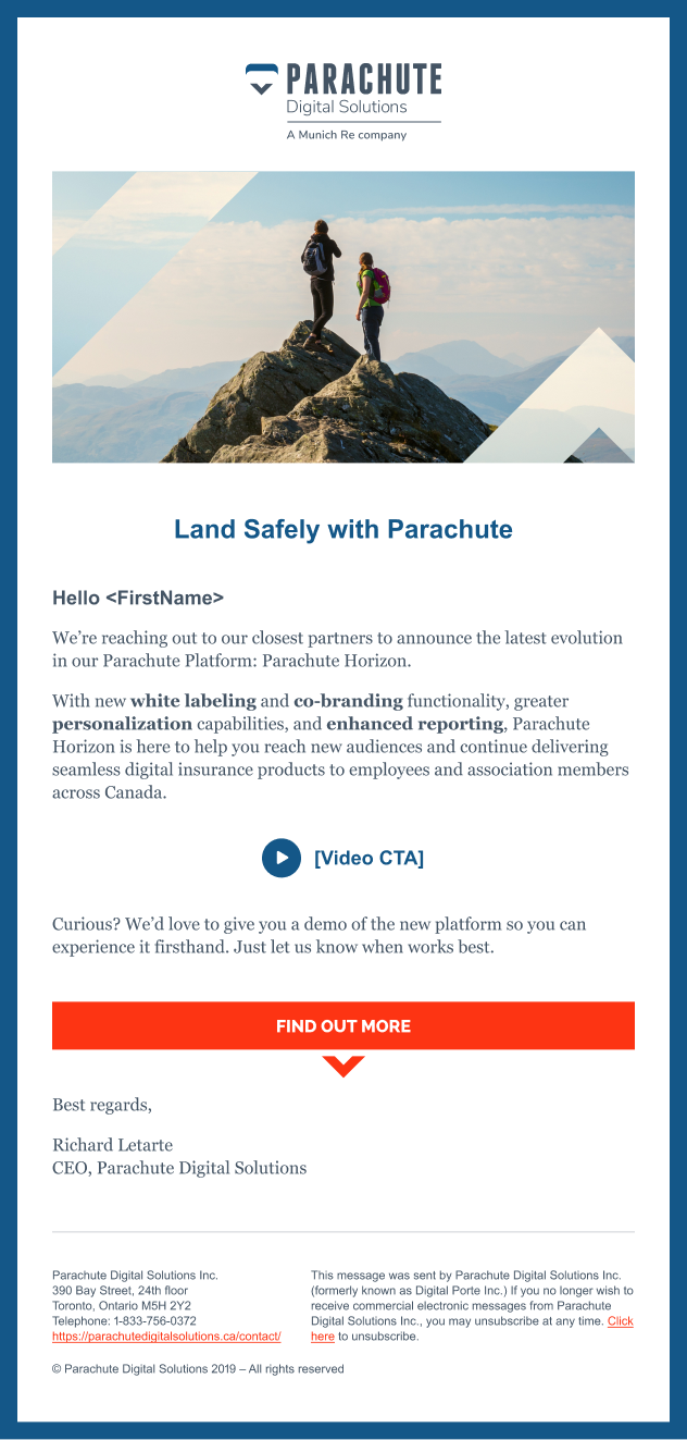
I provided Parachute Digital Solutions Inc. with email marketing campaigns. I designed and built fully branded bespoke email campaigns adhering to the strict anti-spam, design, code and best practice guidelines required for email marketing.
Online platform
White labeling
Personalization
Underwriting
Policy management
Land responsivelyA mobile experience
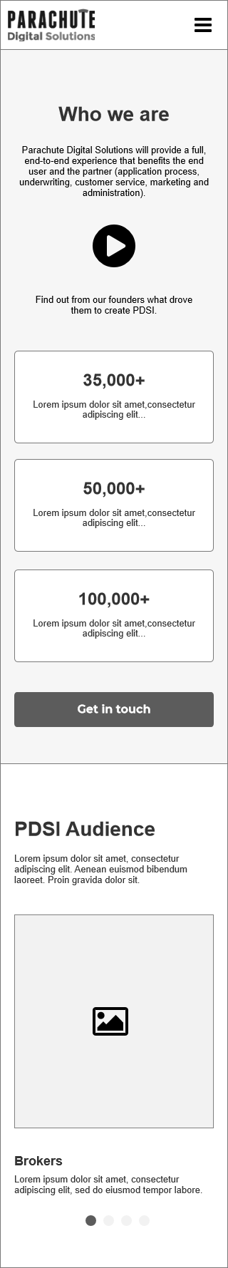
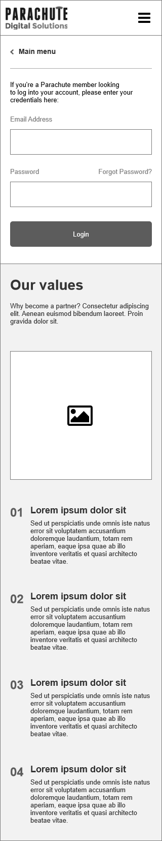
The Parachute’s website is made for mobile devices, so the Parachute site was designed to be fully responsive.
It’s iconicQuick, clear and practical
I supplemented the Parachute brand with clear, friendly and easy to understand iconography.
Styleguide & UI Elements
What makes a parachute? A bold logotype, an elegant but muscular typeface, and a bunch of muted colors with references to world insurers. Because it involves so many elements, a website is often the clearest distillation of a brand. For Parachute’s new site I created several different UI elements for the in-house team to work with.

"The positive feedback from Parachute users and prospective customers on the website was instantaneous. It was great for Parachute Digital Solutions to receive such glowing reviews, but it was the data on conversion rates that I focused on. I actually saw a 27% lift in conversion rates blended across all traffic sources."

Alexandre Moreau
Featured projects
I partnered with early-stage startups and large corporations through the years. Take a look at some of my selected case studies.