MyRigThe ultimate copilot
MyRig is an iOS app for new driversI came to Current Motors, Inc. with a prototype and a name. I worked to design a powerful copilot, ready to conquer the world.
At Current Motors, Inc. they are obsessed with making their vehicles more comfortable, convenient, and user friendly. They want to foster design thinking and shift away from major automobile manufacturer existing apps to holistic and customer centric approach to business.
Current Motors, Inc. asked me to build their new Driver app with most functionalities that some of their competitors already had. The company also wanted to set itself apart from its competitors with a more friendly and human approach.
Meet the business goals of Current Motors, Inc. and aligning those goals with the needs of the users. Create an interactive prototype and UI screens that gives the user personalized car informations and driving connected services. Improve app usability and ergonomics, customer experience and engagement.
User research, personas, card sorting, scenarios, prototyping, UI design.
User ResearchA competitive analysis
Without pre-existing insights, I conducted a user research through a competitive analysis and user interviews to explore drivers digital habits, be familiar with the design patterns and get inspiration for designing an all-features app. I studied car apps in various product spaces to inform important design decisions and to really think out of the box.
I wanted to create a user friendly interface that would restructure remote commands, manage vehicle’s maintenance and give an elevated ownership experience with tips to improve driving, easy access to assistance and connected services.
"I conducted online surveys and phone interviews on 20 people. I asked them 10 different questions regarding their driving habits and phone use. For example, what is your favourite feature on your car app? Also, what would you expect from a new driving experience? Based on a demographic of 64% female and 36% male, a lot of drivers shared common habits on car apps. Most users remotely turn their vehicle on or off, check oil life, get directions, set parking reminders and make service appointments."

Alexandre Moreau
Shifting gearsDesigning for drivers
I conducted extensive driver interviews, participated in drive alongs, held in-office workshops, shared prototypes, and above all else, listened to drivers’ likes and dislikes – what was working for them, what wasn’t, and what could be better.
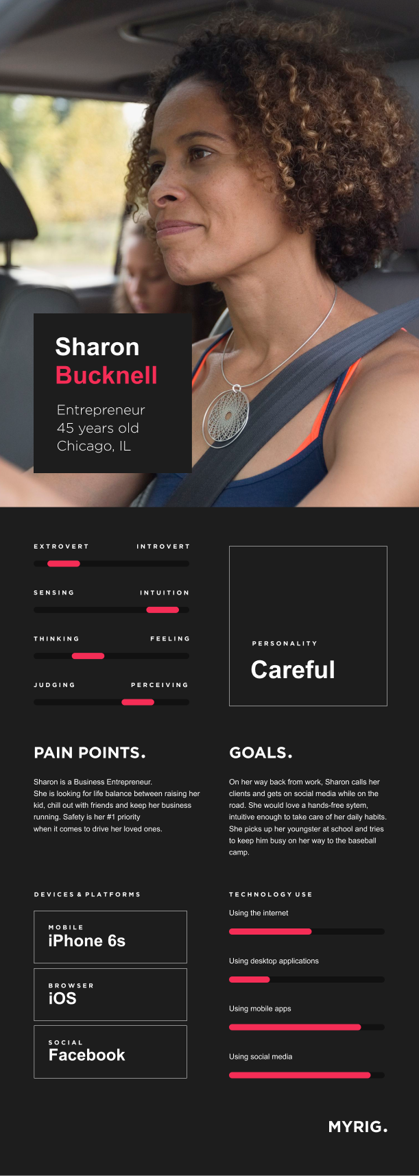
Sharon Bucknell
Business Entrepreneur
45 years old
Chicago, IL
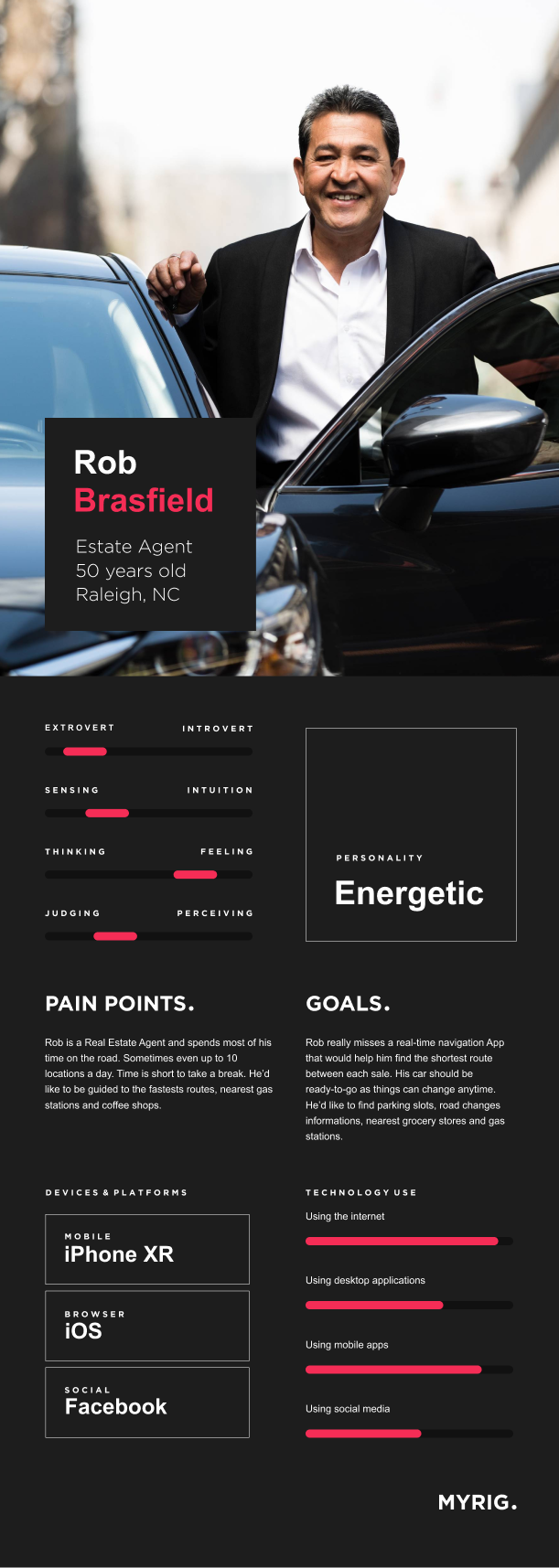
Rob Brasfield
Real Estate Agent
50 years old
Raleigh, NC
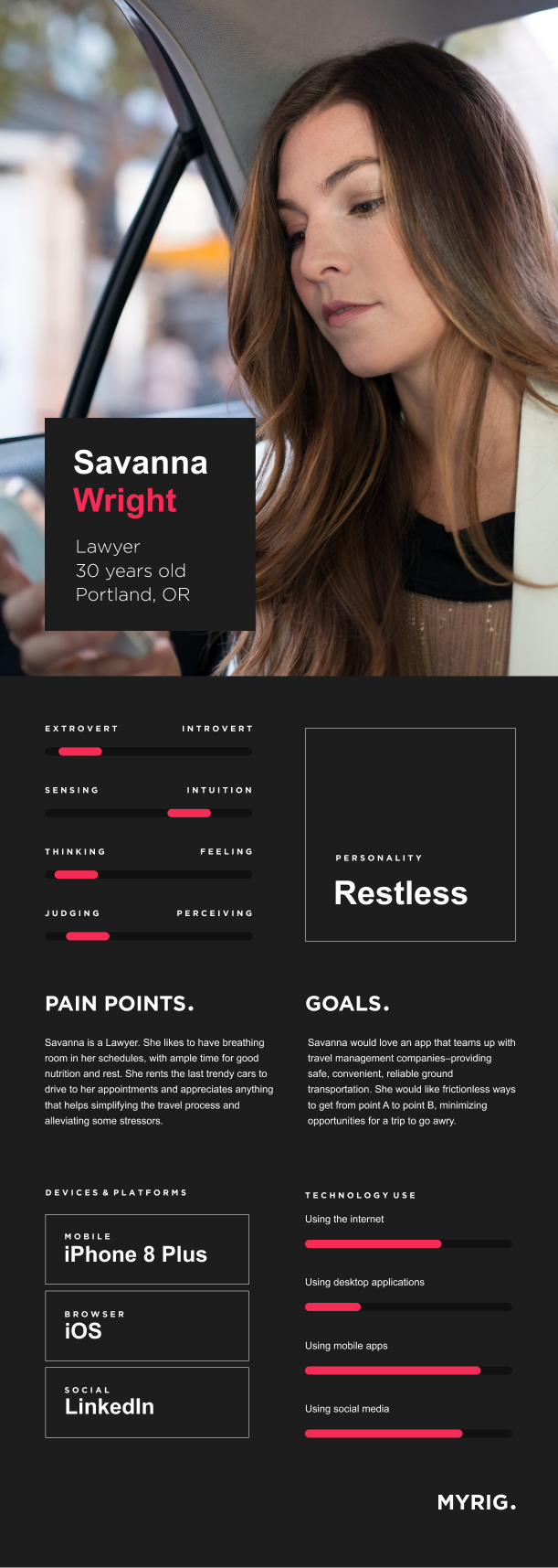
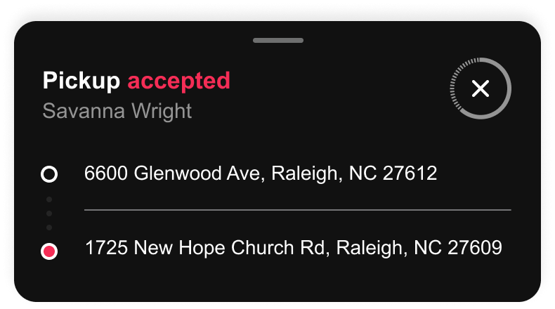
Savanna Wright
Lawyer
30 years old
Portland, OR

Craig Berube
Delivery Driver
40 years old
Jacksonville, FL
PersonasMeet the drivers
How do you create a perfect persona? After many meetings and several workshops I ended up with 4 driver profiles that made everybody happy. Seriously. Everybody.

"The drawback of all our modern day push-button technology is that it can be easy to forget the real flesh-and-blood people behind every product and service. Driver personas aim to correct that oversight."
Alexandre Moreau
Creating scenariosIn the driver’s seat
I wrote a couple of scenario maps to personalize drives and engage testers. I spent a long time with users crafting the perfect scenario that would let every drive shine. Bright. Like a diamond.
PrototypingHow it all started
I built a prototype, complete with driving scenarios. Users moved fluidly through various Apple devices as they sat at home, on the train, or in their car. Understanding how devices interacted with the users helped me think about the experience from a more strategic standpoint.
The experience should be clear and intuitive to use. The driver should not have to guess about how MyRig worked from their device.
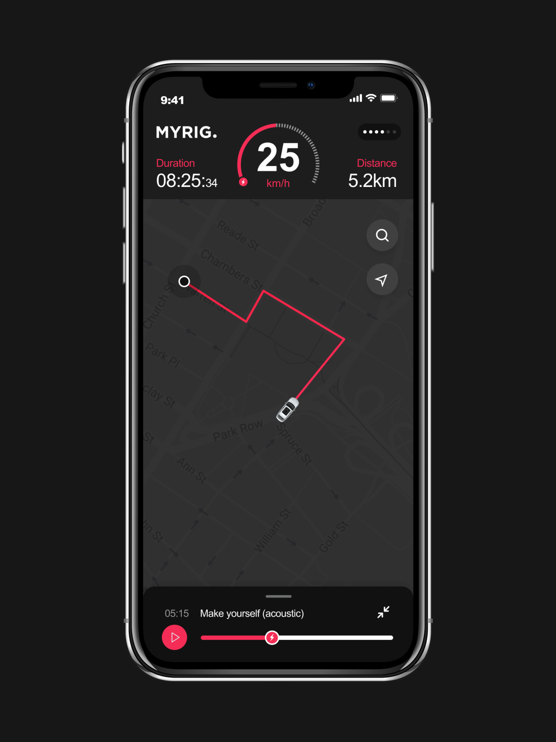
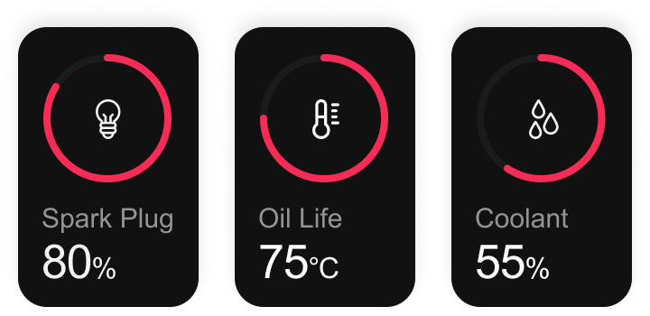
Ready, set, driveBetter in dark mode
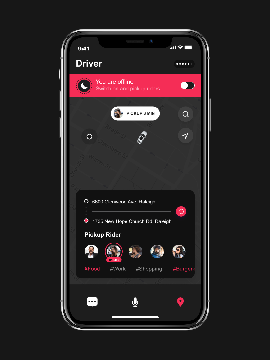
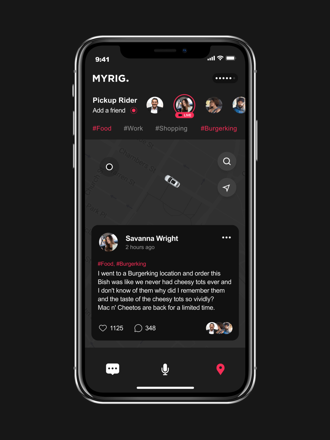
I wanted to create a better experience from the name “MyRig” – literally. MyRig’s original premise is simple: push a button, get real-time driving informations. You don’t need to set your destination. You don’t need to select a product. Car status, features, and controls are paired with actions so that no matter how the phone is used — on a phone mount in a car, or in a courier’s pocket while walking to deliver a meal — car settings are always easily accessible and understood.
From this point on, every push on this button is designed to enable drivers to go forward and backward in their journey. I thought about the music you might want to listen to en route, the menu at the restaurant you’re heading to, and how you could stay connected to the people you’re going to see. I built a platform for content that will put you and your journey at the center.


" I wanted to put the things that mattered most front and center, like safety, car status, pickups, destination search, earnings trackers, and driving opportunities. Now drivers can check if they’re ready to go with the push of a button – one that lets them know their rig is always ready for them."
Alexandre Moreau
On the roadJoin the ride
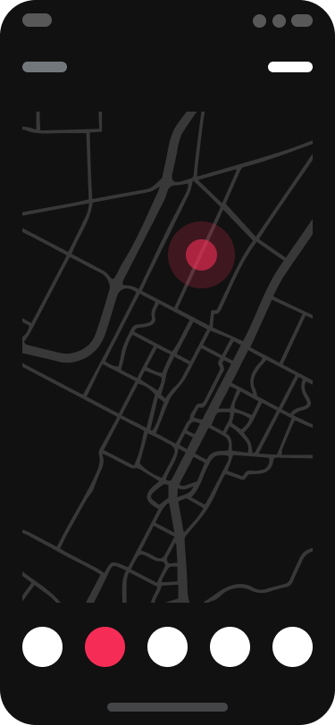
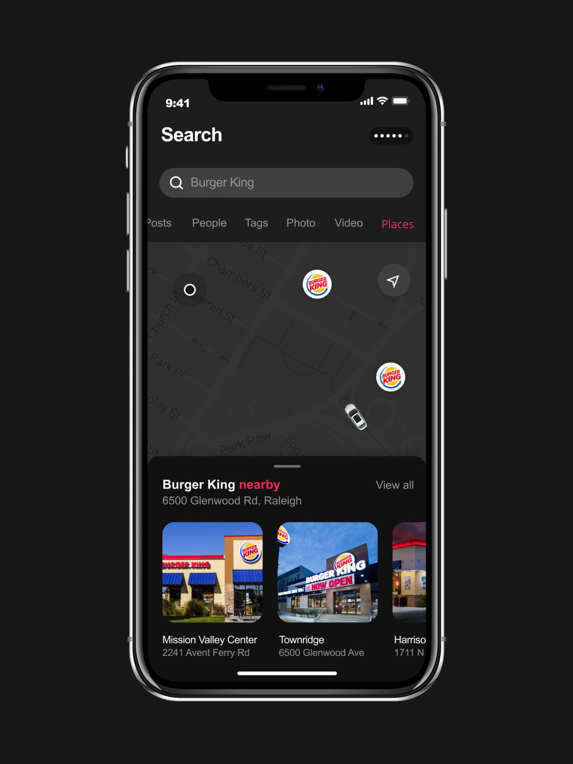
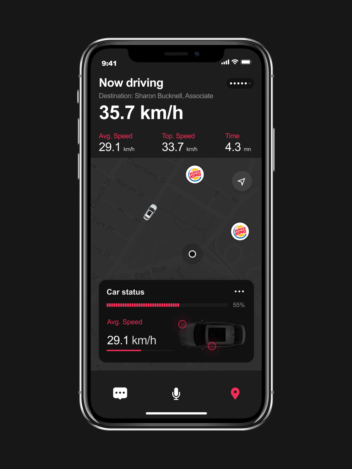
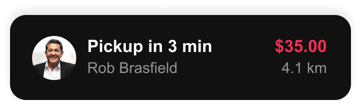
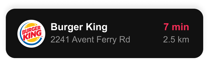
Drivers want to go where they are needed most – where there are the best opportunities to connect with riders. In most car apps, a lot of information is buried, making it difficult for drivers to find upcoming promotions and nearby events. MyRig surfaces opportunities to help drivers decide where they’d like to drive. With a less cluttered home screen, MyRig is able to devote more real estate to the map: the most important surface when it comes to navigating the city.
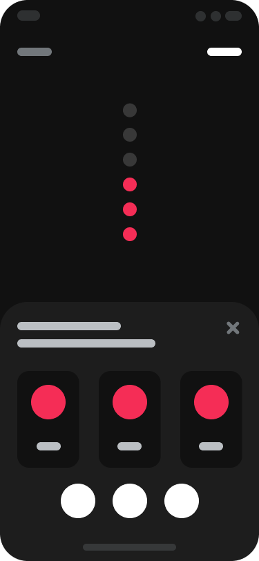
By knowing your destination, MyRig can give you opportunities to make better decisions with just the right amount of context. The app displays upfront fares for riders pickups so you can make a clearer and simpler choice on how to get where you’re going. I continue to strive to make the driver experience as safe, reliable, and pleasant as possible. The pickup alert is a great step on this ongoing journey.
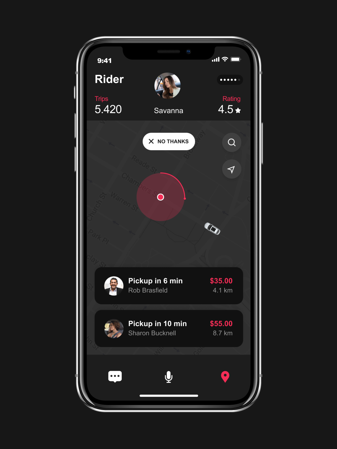
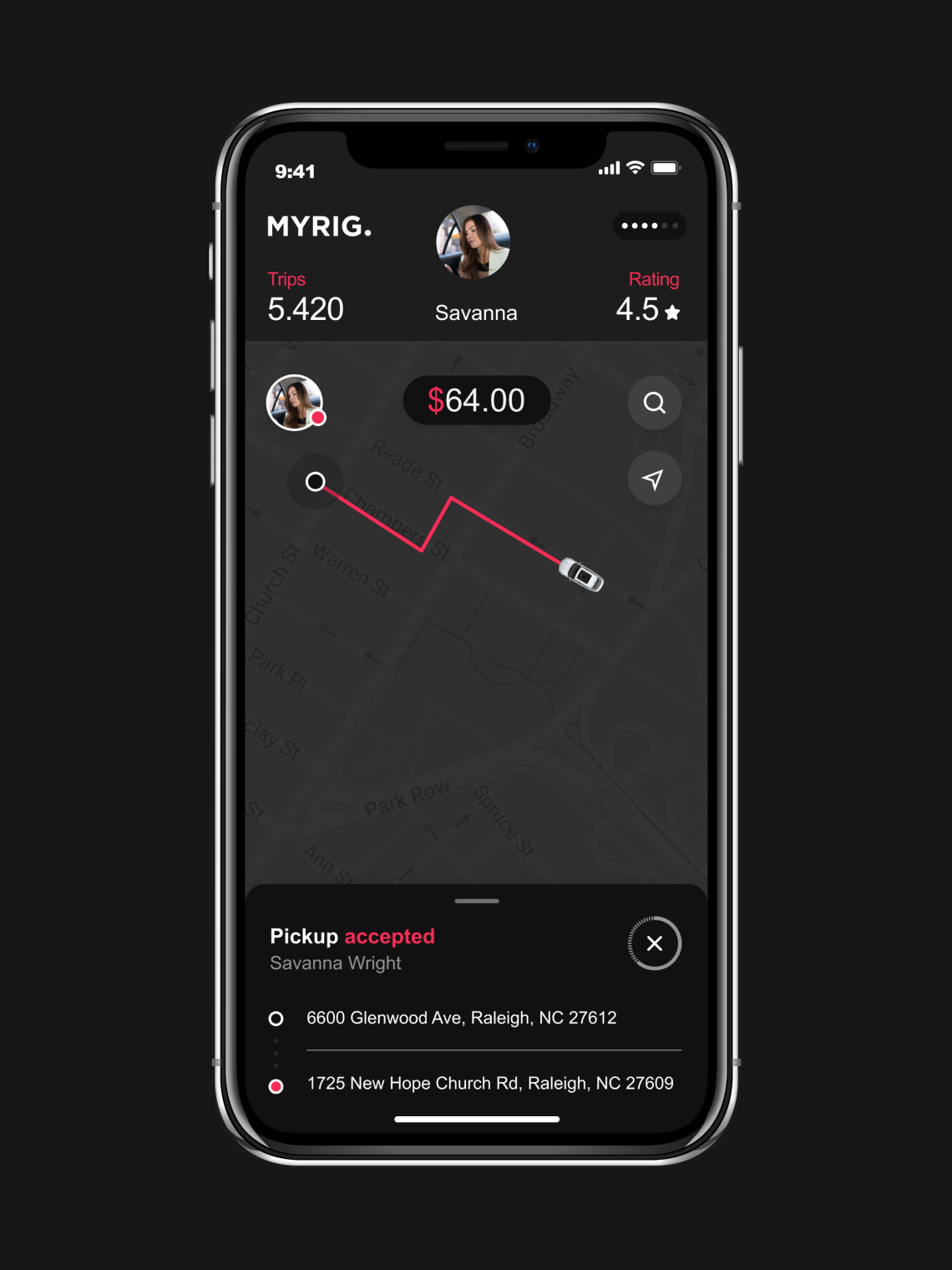
"Drivers told me what information was valuable to them and when it would be most useful to see it. They wanted to see trip distance, time and the rider’s name for the duration of the trip. Couriers wanted delivery instructions and order details all in one place to avoid any hiccups. I landed on a design that consolidated trip information and action in the bottom sheet for both current and future trips."
Alexandre Moreau
The tripEnjoy the drive
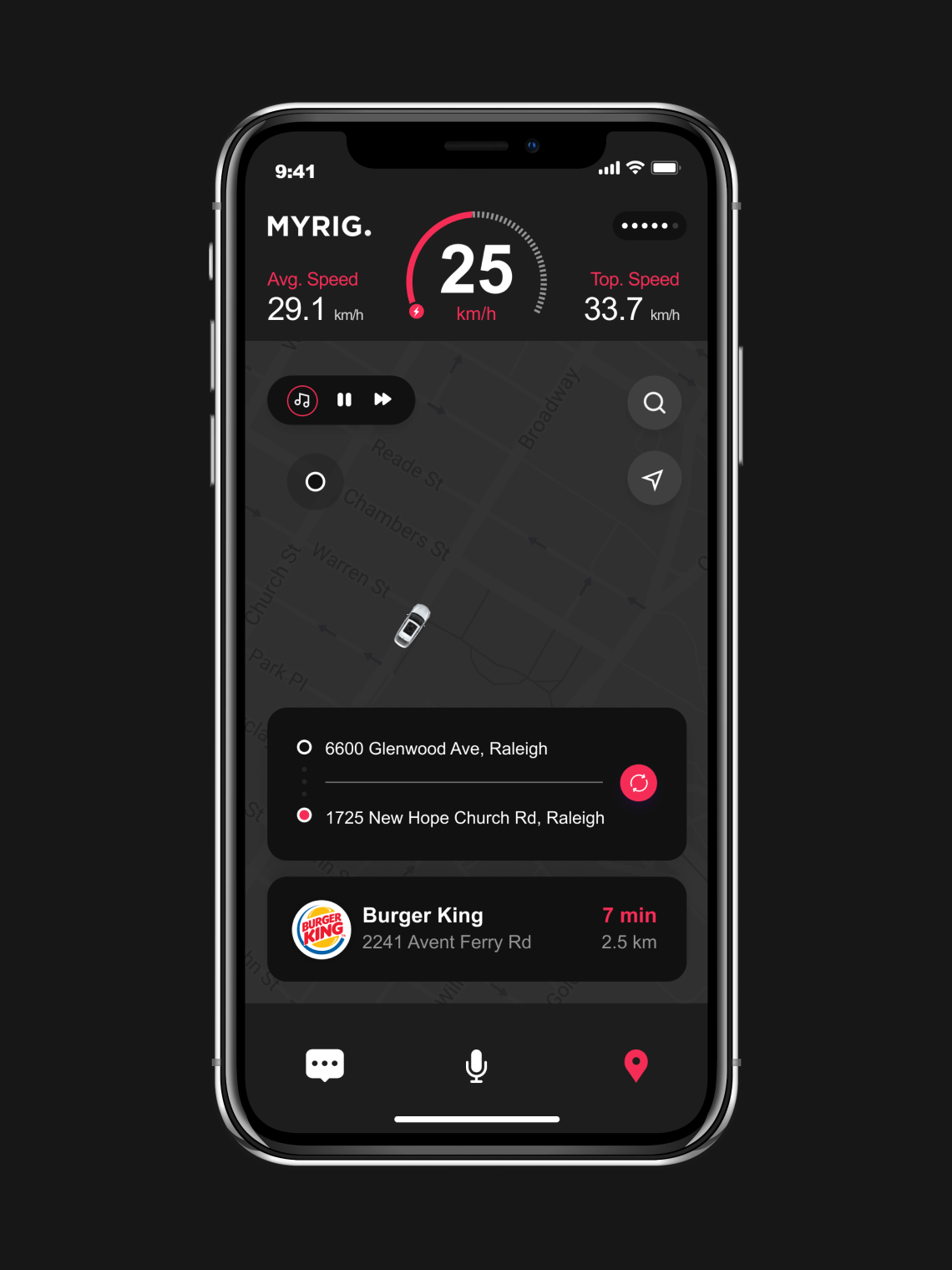
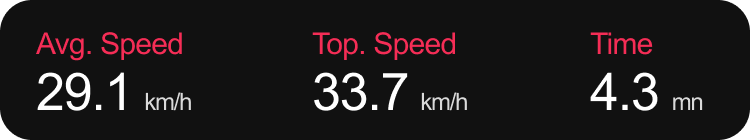
As I looked ahead at each step, I realized I was neglecting the longest part of the user experience—the trip itself. The trip experience went through the most design cycles and iterations. List views, tabular representations, selectors… I tried it all to see what worked best. Ongoing user research, interviews and iterative prototyping using InVision played a crucial role in my process.
Since the necessary trip information has to be interactable from an arm-reach distance and understood at a glance while driving, I designed the trip experience with the ‘3-foot-1-second rule’. I decided when and how much info to present, what actions to be highlighted at a certain state, and all of the above with glanceable graphics and legible-from-afar text.
"MyRig app is tailor-made for drivers. Every day, I'm collecting great constructive feedback from drivers, and now that I’ve rolled out the starting lineup, I’m excited for the design possibilities to come. As Current Motors, Inc. has rolled it out over the past few months, it has been great to see drivers using MyRig."
Alexandre Moreau
Design for scaleConsistent design
I developed standards across a number of elements from foundational parts to common components. From the start I wanted to be sure to create an app that other people could use, build upon, and extend internally. Building an entirely new product and a design system at the same time was a challenge, especially at this scale.

Touchy-feelyMobile, literally
Everything behaves a bit differently on mobile. For touch-based devices, I create some innovative custom solutions.
Glanceability and tappability
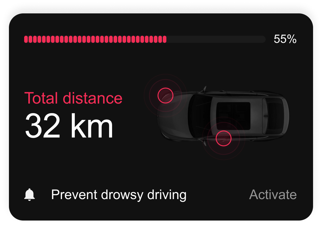
The “3-Foot-1-Second” Rule is a good example of the design considerations I took into account: drivers are looking at a smartphone-sized screen from about three feet away, for about one second at a time. This means that “glanceability” and “tappability” are priorities. At every point, I needed to answer the question: “what is the essential information that the driver needs right now?”
— Grid
— Status Bars
— Empty States
— Spacing
— Forms
— Typography
— Action Sheets
— Headers
— Colors
— Alerts
— Lists
— Content
— Avatars
— Map Interfaces
— Icons
— Buttons
— Loading Indicators
— Cards
— Selectors
— Drop Shadows
— Date & Time Pickers
— Tabs
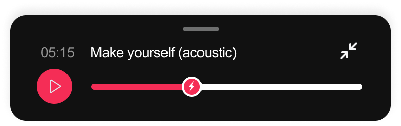
— Music Players
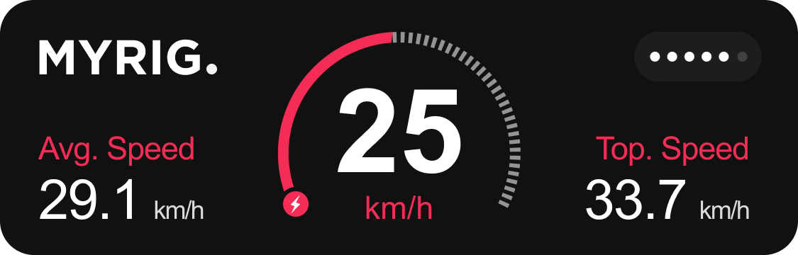
— Speedometers
Featured projects
I partnered with early-stage startups and large corporations through the years. Take a look at some of my selected case studies.